HOW TO IDENTIFY DIFFERENT PRINTINGS OF THE 1892-98 ISSUE
I am a fan, but in no way a specialist of the early issues from Ottoman Turkey. Recently I picked up a small hoard of Turkish stamps and rather than just consult Scott Catalogue, I decided to look the stamps up in the Isfila Catalogue. There was nothing of note in either of them, but I also checked the Isfila Specialized Turkish Stamps Catalogue - Part III: 1876-1901 (published 2010) and it was there that I noticed references to various different printings of this issue. I checked my older copy of Pulhan and Pulko but there was no mention. I did a deep dive into Google searches, which also yielded nothing. Unfortunately, I do not have access to Passer or to Andreas Birken's research.

Here is the picture of my basic set of 5 stamps for regular postage. In Turkish, it is known as the
Armali Pullar (literally Arms Stamps). Scott catalogue entitles this series
Arms and Tughra of "El Gazi" (The Conqueror) Sultan Abdul Hamid. Abdul Hamid's Tughra reads '
Abdulhamid Han bin Abdulmecid el-Muzaffer Daima' which translates into
Sultan Abdulhamid, son of Abdulmecid, the ever victorious. Strictly speaking, this is not a Ghazi nor did Abdul Hamid II ever claim to be a Ghazi. However, that is not the point of this post.
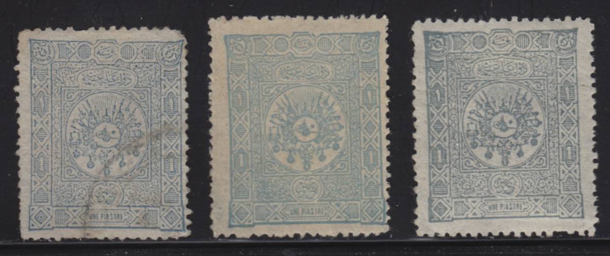
I chose the 1 Piastre Pale Blue (Sc#97) to begin with. It comes in a range of shades from Light Blue to Grey Blue and onto Grey.
In the Isfila Specialized III, they provide pictures of the 1 Piastre noting:
Sky Blue Shade - Fine First Printing
Grey-Blue Shade - Fine Second Printing
Grey Shade - Less Fine Third Printing
The pictures of each stamp are small, and there is no description other than the above; no way to determine how to identify the different printings.
I have found some significant differences in the quality of the printing. For instance, the below two stamps....
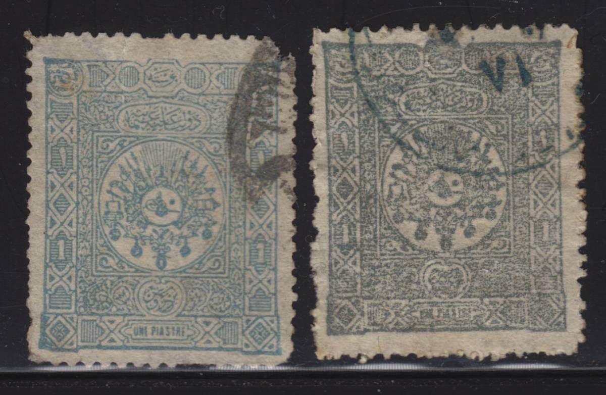
The one of the left could certainly be considered a "Fine Print", though whether it is the First or Second Fine Print, I have no way of determining. The stamp on the right is definitely "Less Fine"; in fact "Coarse" may be a better description. Isfila does not categorically state that there are ONLY three different printings and again, other than the "Fine" or "Less Fine", it makes no other distinction.
I started hunting around with magnifiers, trying to identify certain clues that could assist in easily identifying the different printings. Isfila states "printings" so I work under the assumption that new plates were not prepared, but that the old plates brought out for a new round of printing. The issue was printed using the Typographical or Letterpress method, whereas the ink sits on the raised edges of the die as opposed to Engraved or Intalgio, where the ink sits in the recesses of the die. So I assume that over time, the plates will be worn and the lines on the paper less distinct. My only issue with trying to see this, is that over-inking or under-inking of plates could perhaps produce the same result. I always question what I am seeing and my own ability to distinguish differences, which is probably why I am not much of a "fly-specker".
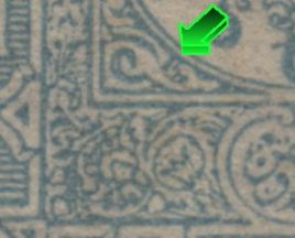
At any rate, I concentrated on one portion of the stamp as per below.
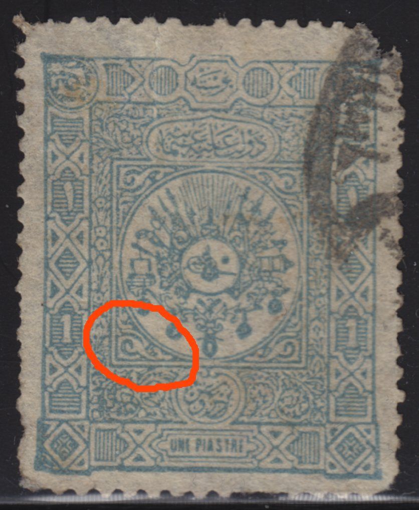
This first close up of the area is one with some of the finest lines and details. I concentrated on the sickle-like element to the left, and the adze-like element on the right. Both elements have large areas between the lines that are white and have no ink in them.
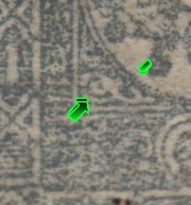
This first close up of the area is one with some of the finest lines and details. I concentrated on the sickle-like element to the left, and the adze-like element on the right. Both elements have large areas between the lines that are white and have no ink in them.
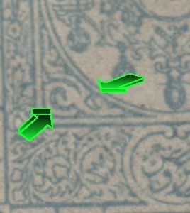
I had 42 stamps to study and 3 of them showed the "adze" with some lines on them. Two had 2 lines, and 1 stamp had only one line. Perhaps it is a constant plate variety.
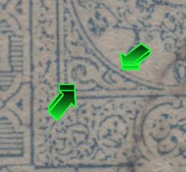
In the above, the two elements are well formed, but I suspect that the plate was under inked, which accounts for fine impression. You can see that both the "adze" and the "sickle' have un-inked areas in the middle.
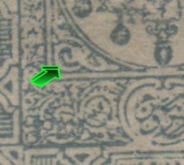
On the above image, you can see that the "sickle" is becoming more of a solid element will less area inside it being un-inked. The adze has developed a line between the 'head and the handle", so to speak.
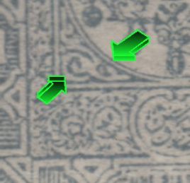
In the above, the "sickle" is now solid colour.
In the above, I would bring your attention to the curved element over the "sickle". Originally it was connected to the frame line on the left by two lines. Now the bottom line has completely disappeared. The curved line has also joined up with the 'adze'.
In the above picture, it illustrates a very coarse printing. This is the only stamp I have that is like this, so perhaps it is an aberration or one of the last printings where the plate was very worn out.
As for the other stamps in this issue:
10 Paras Green - Isfila mentions a First and Second "Fine" Printing
20 Paras Red - The range of colours is great, between a Violet Brown or Claret to a Dark Pink and a light pink. Some catalogues give numbers for the different shades. Isifil mentions:
1. a Rose shade "Fine" First Printing
2. a Claret shade "Fine" Second Printing
3. a Light Claret shade "Less Fine" Third Printing
4. a Red-Lilac shade "Careless" Fourth Printing
5. a Dull Lilac shade "Careless" Fifth Printing
1 Piastre we covered in detail above
2 Piastre - Multiple Printings not mentioned
5 Piastre - Multiple Printings not mentioned
If one were to fully study this issue, you would also have the following to study
Postage Due Stamps - Same design - 3 values all in black
Printed Matter Stamps 1892 - 5 values - normal postage overprinted in black with "IMPRIME" in a box with rounded corners. Most are forgeries. The only genuine issue has the box with only three sides.
Printed Matter Stamps 1893-1898 overprinted in Ottoman Turkish Script "MTBV" which is "Matbua" or Printed Matter.
Of course, like many Ottoman stamps, there were also lots of other overprints applied to old stock remains of this issue.
I was hoping someone might be able to assist with how to determine the different printings. As I mentioned at the start, I don't have the Passer's work or Andreas Birken's. I would certainly be interested in purchasing them if I thought that they contained information on these different printings.
Anyway, I hope this is of interest to some, and I encourage any guidance anyone can provide in order to further study this issue.
All the best,
Brad


