| Author |
 Replies: 22 / Views: 4,824 Replies: 22 / Views: 4,824 |
|
Pillar Of The Community
Netherlands
5356 Posts |
|
|
DesignIt was tradition for the Dutch post office to, contemporaneously, have two permanent series in circulation. Stamps with the effigy of the monarch prepaid the basic rate for inland carriage of a letter and higher rates. A stamp with a design based on numerals served as make-up values or covered the rates for printed matters and postcards lower than the basic inland letter rate. On 4 April 1946, the first official Aesthetic Advisor of PTT (Posts, Telegraphs and Telephone), Mr. Spanjaard, had a meeting at the printing firm Johan Enschedé of Haarlem. The subject of the meeting was the printing of a new permanent series showing the monarch's effigy. After Germany occupied the Netherlands in May 1940, current 'Lebau' stamps with a guilloche in black obscuring the country name 'NEDERLAND' and original value were issued, replacing the current stamps showing the effigy of Queen Wilhelmina. During the meeting, Mr. Spanjaard remarked "in the foreseeable future, the 'Lebau' stamps will be replaced by a new design." The 'Flying Dove' design by J.J.C. (Chris) Lebau had been current since 1924. 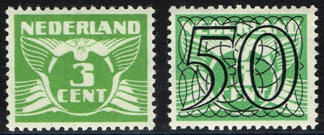 Lebau's 'Flying Dove' design without and with 'guilloche' designed by Van Krimpen Lebau's 'Flying Dove' design without and with 'guilloche' designed by Van KrimpenSoon after the meeting, PTT commissioned Jan van Krimpen with the design of a new numeral stamp. Jan van Krimpen was a typographer and self-taught calligrapher. He had been commissioned with the design of typographic elements of Dutch stamps since the 1920s. His previous work included the 1940 'guilloche' on the Lebau-design. 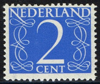 Van Krimpen permanent series design Van Krimpen permanent series designThe design is simple and consists of the country's name, the value, the word 'cent,' and two arabesques. The arabesques consist of two intertwined calligraphic lines. Van Krimpen drew the arabesques by hand at ten times the size of the stamp. They emanate from the two letters 'N' of 'NEDERLAND' and act as a vertical frame of the numeral that is the focus of the design. The arabesques are typical for the time when the Netherlands were recovering from the chaos of five years of German occupation. They were a bridge to the past and familiarity of the pre-war era. Van Krimpen had designed several founts, especially for the printing firm Joh. Enschedé. His founts often show his interest in historic book printing. For the stamps, he drew new letters. These are reminiscent of his 'Spectrum' fount he had designed for the publishing company 'Het Spectrum' of Utrecht.
|
|
Send note to Staff
|
|
|
|
|
Bedrock Of The Community
Australia
38679 Posts |
|
|
Pillar Of The Community
Netherlands
5356 Posts |
|
|
ValuesThe set comprises nine stamps issued between 1 November 1946 and 1 April 1957. The stamps covered basic postage rates for printed matters or served as make-up values. The first three stamps in the new design appeared on 1 November 1946. Two of the stamp prepaid carriage of printed matters. The third was a make-up value. From 1 November 1946, the basic postage rate for inland carriage of printed matters up to 20 grammes increased to 2 cents. This had stood at 1½ cent since 1 February 1928. The 2 cent stamp, printed in cornflower blue, covered this tariff. The 4 cent stamp, printed in bright green, prepaid the new basic rate for carriage of printed matters up to 20 grammes abroad. The NVPH catalogue lists the colours as blue and olive green, respectively. The third stamp issued on 1 November 1946 was the 1 cent red make-up value. The rates for local delivery of a postcard and a letter up to 20 grammes were raised by one cent. The former increased from 4 to 5 cents and the latter from 5 to 6 cents. PTT issued stamps with the effigy of the monarch to prepay for anything upward from the basic rate for carriage of a postcard or a letter. The 1 cent red made up the difference between the old and new tariffs. A 6 cent stamp with the effigy of Queen Wilhelmina prepaying the local letter rate was not issued until 1947. The 1 cent stamp also prepaid the carriage of braille items up to 1 kilogramme. 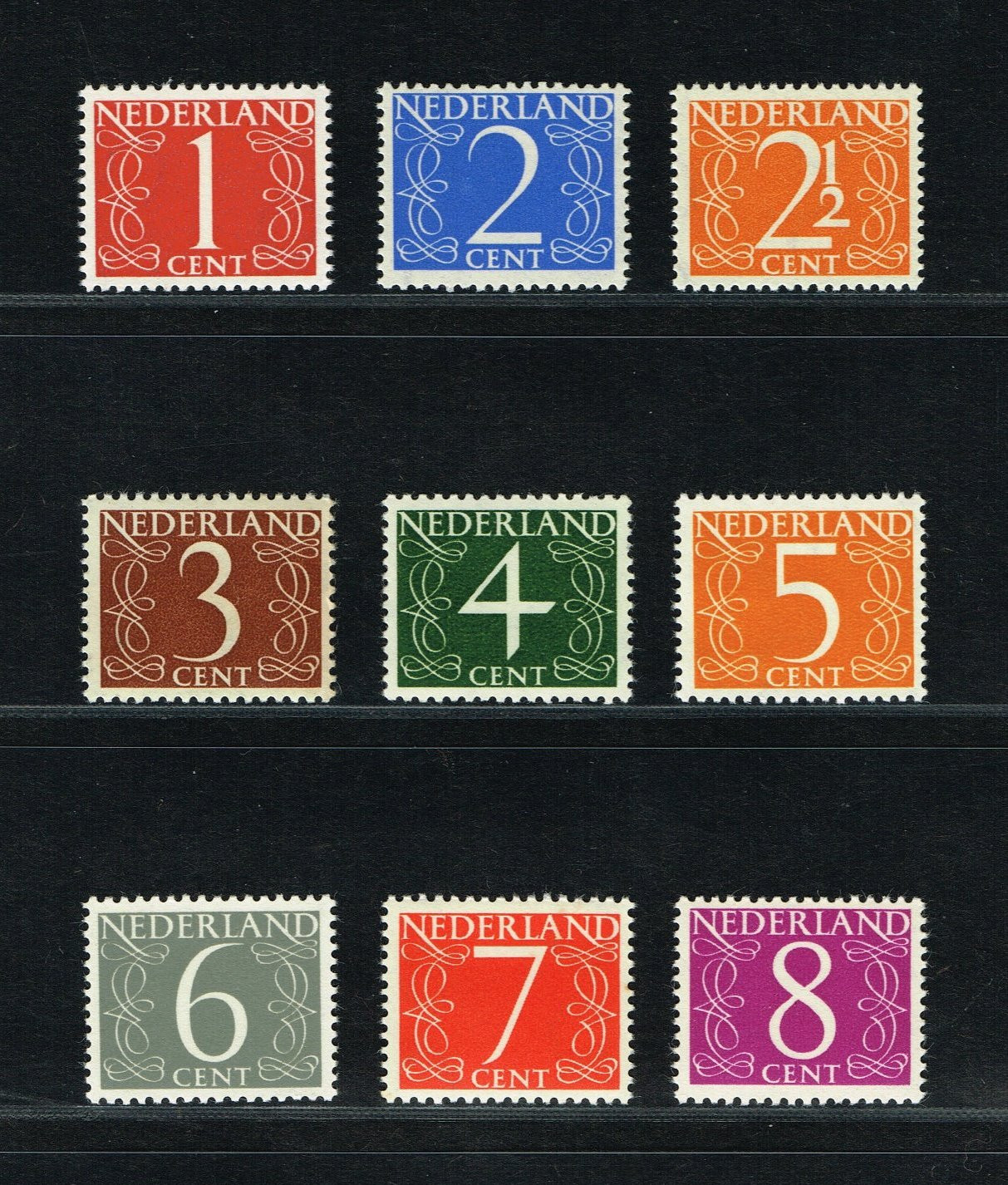 Van Krimpen permanent series values Van Krimpen permanent series valuesOn 1 November 1946, the rates for inland carriage of postcards (5 cents to 7½ cents) and letters up to 20 grammes (7½ cents to 10 cents) not delivered locally rose by 2½ cents. The orange 2½ cent stamp in the 'Van Krimpen' design that made up the difference was not issued until 15 October 1947. There was sufficient supply of the 2½ cent 'Flying Dove' design by Chris Lebau. During its lifetime, the 2½ cent stamp only served as make-up value. The half cent that had not been minted after 1940 was phased out from 1948. The 2½ cent stamp was popular for several reasons. Orange is the Dutch national colour, alluding to the historic title of the royal family as Princes of Orange, a region in France. The national sentiment after five years of German occupation was strong. The orange colour also showed good contrast to cancellations, making it a popular stamp to use for special cancellations. Finally, as the half cent soon was phased out, this stamp was among the last that had a half-cent value. A further rise in basic tariffs ensued on 1 July 1953. The tariff for carriage of a locally delivered letter was raised from 6 to 7 cents. This was met by a red 7 cent stamp. The local-delivery rate for postcards increased from 5 to 6 cents. The grey 6 cent stamp was not issued until September 1956. This, probably, was due to exhaustion of stock of the 6 cent stamp with the effigy of Queen Juliana. On 1 July 1953, the basic inland letter rate rose to 15 cents. To make up the difference with the current 12-cent stamp with the effigy of Queen Juliana, a brown 3 cent stamp in the 'Van Krimpen' design was issued. A 3-cents tariff had existed for carriage of certain newspapers since November 1946, but demand for the value was not sufficient to issue it for that purpose. A 5 cent orange stamp replaced the old 4 cent stamp prepaying the new basic rate for international carriage of printed matters up to 20 grammes. The final value of 8 cents printed in purple was not issued until 1957. All stamps had the usual watermark consisting of vertical lines of circles. 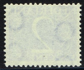 Van Krimpen permanent series watermark Van Krimpen permanent series watermarkThe 2 cent and 8 cent stamps with a black number printed on the back come from stamp rolls. |
Send note to Staff 
|
|
|
Pillar Of The Community
Netherlands
784 Posts |
|
|
Thank you NSK for this post.
Concerning the 1 cent red stamp.
For a number of years the blind were able to send braille (post)cards within the Netherlands for 1 cent. I believe from 1924 to first of Februari 1971.
In 1970/71 the 1 cent stamps became no longer neccesary, postal rates were rounded up or down to the nearest 5 cents.(not sure how long they were still for sale)
With this the 1 cent postal rate for the blind ended and it became free of postage(a few years later that changed but that is a different story).
Hope you will continue the post. |
|
Send note to Staff
|
| Edited by Johan Buvelot - 02/28/2022 5:08 pm |
|
|
Pillar Of The Community
Netherlands
5356 Posts |
|
|
Thanks Johan. Interesting additions.
I suppose the postcard would be more than covered by the 1 cent tariff that covered braille items up to a kilo.
The intentional varieties according to "NVPH speciale catalogus" will follow. |
|
Send note to Staff
|
|
|
Pillar Of The Community
Netherlands
5356 Posts |
|
|
'Gouda' stampsNo, these are neither stamps depicting the cheese from the town, nor made from cheese. On 27 August 1962, PTT issued three stamps from the current permanent series printed on fluorescent paper. These were the 4 cent and 8 cent values of the 'Van Krimpen' design and the 12 cent of the contemporaneous series showing Queen Juliana 'En Profil' designed by Sem Harz. The stamps had been printed for an experiment with a 'Mark II' facer-canceller machine. The machine was tested in the Gouda area between November 1962 and January 1963. 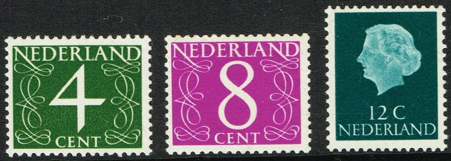 Luminescent 'Gouda' permanent series stamps Luminescent 'Gouda' permanent series stampsThe 6 cent 'Van Krimpen' and 15, 20, 25, 30, and 50 cent 'En Profil' stamps had also been printed on the same paper but were never issued. The executive director of the Posts who had to approve any stamp issue decided against the issue of these six stamps on fluorescent paper. It had been expected collectors would buy some two-thirds of the issued sets. He considered the fl. 1.70 for the complete set too high. A contemporaneous set of culture fund stamps (Zomerzegels) cost fl. 0.90. Gouda was chosen to conduct the test with the facer-canceller machine that used optical signals to recognise the postage stamps and face the item of mail so it would correctly be cancelled. The mid-sized town of Gouda was not too large for a test. It was a sufficiently 'confined' postal area. And Gouda was not situated too far from the town of Leidschendam where PTT had its laboratory from which the test was overseen. The size of the town was important to make it possible to flood the locality with the stamps used for the test. 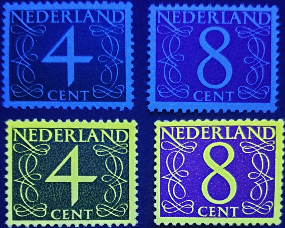 Van Krimpen permanent series fluorescent 'Gouda' stamps Van Krimpen permanent series fluorescent 'Gouda' stampsThe stamps were printed on fluorescent paper without watermark, produced in Germany. They luminesce bright yellow under ultra-violet light. The stamps can be identified by the luminescence and by the lack of a watermark. A year's supply of all the stamps plus 500,000 sets to cater for philatelic demand were printed. The three issued stamps were those that had shown the highest demand in May 1962. There was high demand from philatelists. Many, probably, hoped to have their covers cancelled by the 'Mark II' facer-canceller. This, however, was not used until 8 November 1962. |
|
Send note to Staff
|
|
|
Pillar Of The Community
Netherlands
5356 Posts |
|
|
Phosphorescent stampIn 1967, PTT introduced phosphor coated paper. Unlike the fluorescent paper sourced from Germany this had a phosphorescent coating. The 'German' paper used for the experiment in Gouda had the yellow fluorescent agent mixed in with the pulp itself. On 1 November 1971, PTT raised the basic tariff for inland carriage of a letter from 25 cents to 30 cents. The 30 cent value in the new 'Regina' design would not appear before 1972. Consequently, the 30 cent stamp of the old 'En Profil' design by Sem Hartz covered the rate. On 15 October 1971, this stamp was issued on phosphor-coated paper for facing and cancelling by the Toshiba culler-facers in use by PTT. PTT also issued the 5 cent value in the 'Van Krimpen' design printed on phosphor-coated paper to make up the difference between the old rate of 25 cent and the new rate of 30 cent. This 5 cent stamp is the only value in the 'Van Krimpen' design issued in sheets printed on phosphor-coated paper. Whereas the printing of new stamps occurred on unwatermarked paper, the printing of these stamps occurred on paper with the 'rings' watermark as had the original stamps. 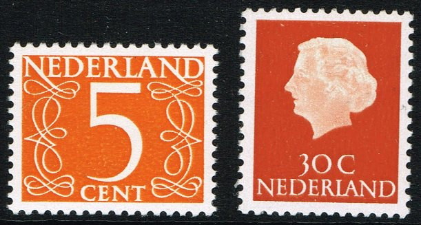 Phosphor-coated issues for 1 November 1971 tariff increase Phosphor-coated issues for 1 November 1971 tariff increaseThe phosphor gives a very dull yellowish-green reaction under ultraviolet light. This is better visible by the naked eye than in below image. This is markedly different from the yellow fluorescent reaction of the 'Gouda' issue discussed above. 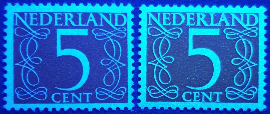 'Van Krimpen' 5 cent ordinary (left) and phosphor-coated (right) paper under long-wave uv-light 'Van Krimpen' 5 cent ordinary (left) and phosphor-coated (right) paper under long-wave uv-lightThe phosphor coating shows a yellow afterglow after exposure to ultraviolet light. 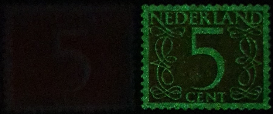 'Van Krimpen' 5 cent ordinary (left) and phosphor-coated (right) paper afterglow 'Van Krimpen' 5 cent ordinary (left) and phosphor-coated (right) paper afterglow |
|
Send note to Staff
|
|
|
Pillar Of The Community
United States
1442 Posts |
|
|
Another GREAT article. Unfortunately the last photo left picture needs redoing. |
|
Send note to Staff
|
|
|
Pillar Of The Community
Netherlands
5356 Posts |
|
|
@Timm,
Thanks.
The last picture is just one picture. There are no left and right pictures, only left and right stamps in the picture.
I took the picture in a closet below my stairs that I use as a dark room.
What the picture shows is the phosphorescent afterglow after turning off the uv-lamp.
The stamp on the left of the picture is that printed on ordinary paper. It does not show any afterglow. What you vaguely see is the slight reflection from the white paper of the little bit of light that enters below the closet door. Otherwise, you would not see anything.
The right stamp was printed on phosphor-coated paper that gives a yellow afterglow for a few seconds after turning off the uv-lamp.
The purpose is to show how to tell the two stamps apart.
I use my Samsung S10 resting on a cardboard box to take pictures showing luminescence. The problem is that it takes the picture immediately if there is light, but with a delay if it is dark. So, I must first switch off the uv-lamp and then take the picture. So, the phosphorescent reaction is not as strong in the picture as it, initially, is to the naked eye.
A scanner is not helpful here, as it does not irradiate first. Also, by the time the scanner will have scanned the stamps, the afterglow will have gone.
This also shows the difference between the fluorescence of the 'Gouda' stamps and the phosphorescence of the phosphor-coated stamps. The former show a strong yellow luminescence when the uv-lamp is on. The latter only shows the strong reaction after turning it off.
Booklet stamps still to come. |
|
Send note to Staff
|
| Edited by NSK - 03/12/2022 05:43 am |
|
|
Pillar Of The Community
United States
1442 Posts |
|
|
Thank you for the explanation. With my 20 year old computer and monitor The last photo only shows the stamp on the right
Perhaps if I had more modern system I would be able to see the left stamp.
Keep up the excellent work. it is greatly appreciated. |
|
Send note to Staff
|
|
|
Pillar Of The Community
Netherlands
5356 Posts |
|
|
Stamps on ordinary paper from stamp booksThe first Dutch stamp book dates to 1902. Stamp books were available from post office counters. On 2 September 1964, PTT issued two stamp books to be dispensed from vending machines. The vending machines made it possible to buy stamps outside normal post-office opening hours. The ensuing link is to a website in Dutch; Google Translate should be good enough to understand what is written. The site tells the history of Dutch machine-vended booklets. https://automaatboekje.nl/Machines had dispensed stamps prepaying basic tariffs for the carriage of printed matters and inland letters. In 1961, PTT started tests with machines dispensing stamp books. They chose a machine produced by Swedish firm Sterner Specialfabrik AB. Sweden had experience with vending machines that dispensed stamp books since 1954. Also, the machines produced by Sterner Specialfabrik AB could dispense two different books. The first machine-vended stamp books cost 1 guilder. Stamp book number 1 contained two 15 cent stamps of the 'en profil' design of Queen Juliana and ten 7 cent stamps of the 'Van Krimpen' design. The former prepaid the basic inland letter rate from 1 July 1964. The latter prepaid the basic inland printed matter rate. Book number two contained six 15 cent 'en profil' stamps and two 5 cent 'Van Krimpen' stamps to make up the value of 1 Gulden. At the time of issue of the stamp book, the 5 cent stamp only served as make-up value. 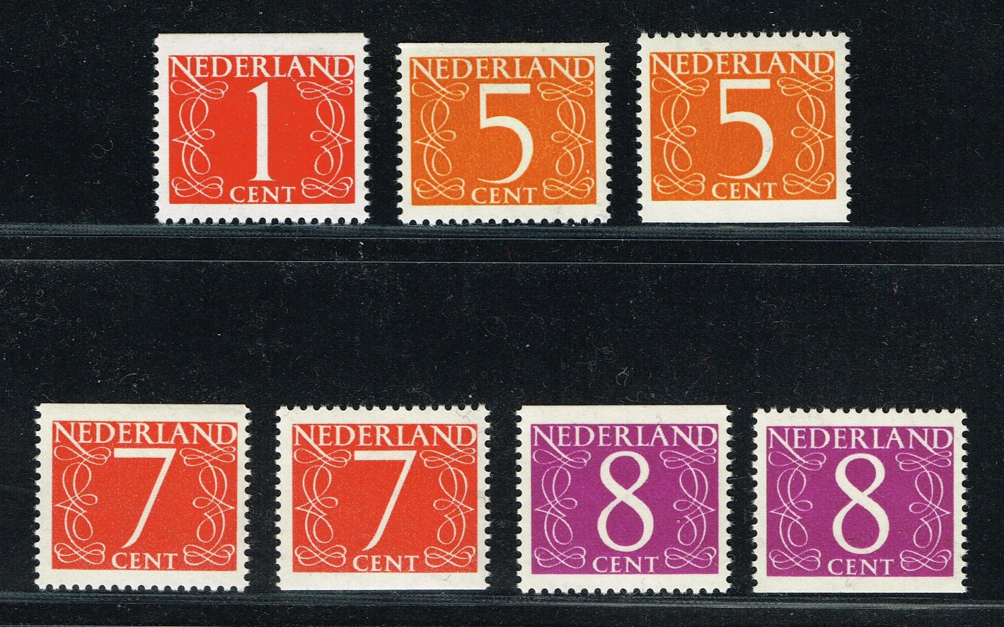 'Van Krimpen' stamps from machine-vended booklets 'Van Krimpen' stamps from machine-vended bookletsOn 1 June 1965, the basic inland printed matter rate rose to 8 cents. The basic inland letter rate rose to 18 cents. Stamp book number 4 contained two 18 cent stamps of the 'en profil' design and eight 8 cent stamps of the 'Van Krimpen' design. The final stamp of the 'Van Krimpen' design to appear in stamp books was the 1 cent stamp used to make up the content value of 1 Gulden. These booklet stamps had the 'rings' watermark. They are easy to identify because they are imperforate either at the top or bottom. Below table lists the machine-vended stamp books and the stamps contained in them. The numbers are the official issue numbers assigned by PTT. From January 1971 (book number 10a) onwards, these appear on the stubs of the panes. The NVPH catalogue uses the same PB (postzegelboekje) numbering.  T = imperforate at top B = imperforate at bottom |
|
Send note to Staff
|
|
|
Pillar Of The Community
Netherlands
5356 Posts |
|
|
Stamps on phosphor-coated paper from stamp booksPart of the print runs of stamp books 8a, 8b and 8c were on the phosphor-coated paper with rings watermark. These contained the 1 cent 'Van Krimpen' stamp imperforate at top. Print runs of stamp book 10 that contained two 5 cent stamps imperforate at bottom also was partly on ordinary and partly on phosphor-coated paper. There were two editions of this stamp book. Printing of edition 10b only was on phosphor-coated paper, as was the case for the two editions of stamp book 11. 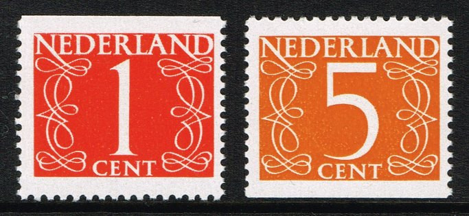 'Van Krimpen' stamps on phosphor-coated paper from machine-vended booklets 'Van Krimpen' stamps on phosphor-coated paper from machine-vended bookletsThe 1 cent on phosphor-coated paper only exists with imperforate top from stamp books from edition 8. The 5 cent stamp on phosphor-coated paper first appeared in booklets from edition 10. The stamps show a much paler yellow reaction than the 5 cent stamp from counter sheets. 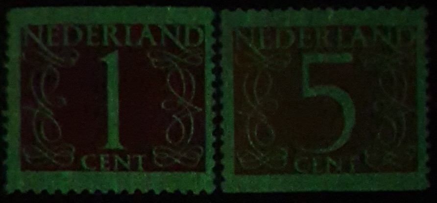 'Van Krimpen' phosphor-coated booklet stamps afterglow 'Van Krimpen' phosphor-coated booklet stamps afterglowBelow table lists the machine-vended stamp books and the stamps contained in them. The numbers are the official issue numbers assigned by PTT. From January 1971 (book number 10a) onwards, these appear on the stubs of the panes. The NVPH catalogue uses the same PB (postzegelboekje) numbering. T = imperforate at top B = imperforate at bottom  |
|
Send note to Staff
|
|
|
Pillar Of The Community
United States
1442 Posts |
|
|
Excellent work, I save every bit of it.
Is there more to come? |
|
Send note to Staff
|
| Edited by Timm - 04/01/2022 10:14 am |
|
|
Pillar Of The Community
Netherlands
5356 Posts |
|
|
Pillar Of The Community
Netherlands
5356 Posts |
|
|
Paper without watermarkUnlike the paper, normally, used for special and commemorative stamps that did not have a watermark, that used for permanent series had one of the 'rings' watermark. In 1969, PTT issued a new permanent series with Queen Juliana's effigy to replace the 'en face' series. The new permanent series no longer had a watermark. Over time, stamps of the new design replaced those of the earlier design in machine-vended booklets. The first stamps to appear were those with a face value of 25 cent. It took until January 1973 for PTT to issue a stamp book containing a combination of stamps in the new design and a 5 cent make-up stamp of the 'Van Krimpen' design. 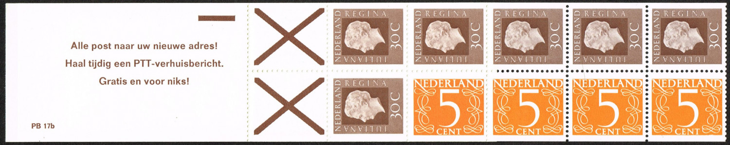 Machine vended 2 gulden stamp book PB17b Machine vended 2 gulden stamp book PB17bPhilatelists refer to the stamps in the 1969 design, again by Sem Hartz, as 'Regina' for an obvious reason: the word meaning 'Queen' appears in the inscription framing the Queen's portrait. Between January 1973 and September 1975, eight machine-vended stamp books appeared that contained a combination of stamps of the 'Regina' and 'Van Krimpen' designs. In all eight cases the 'Van Krimpen' stamp is the 5 cent stamp imperforate at bottom. The paper used for the 'Regina' stamps is phosphor-coated and without a watermark. The 5 cent stamp printed se-tenant on the same paper constituted a new variety, as the only values that appeared on unwatermarked paper were the perforate 4 and 8 cent 'Gouda' stamps. The German fluorescent paper for that issue did not have a watermark either. Below table lists the machine-vended stamp books containing the 5 cent 'Van Krimpen' stamp without watermark. The numbers are the official issue numbers assigned by PTT. These appear on the stubs of the panes. The NVPH catalogue uses the same PB (postzegelboekje) numbering. B = imperforate at bottom  In 1976, the 'Crouwel' design superseded the 'Van Krimpen' design for permanent stamps with a numeral design. These would only appear in values that were a multiple of five cents. |
|
Send note to Staff
|
| Edited by NSK - 04/10/2022 11:44 am |
|
|
Pillar Of The Community
United States
1442 Posts |
|
|
Replies: 22 / Views: 4,824 |
|


