| Author |
 Replies: 140 / Views: 57,170 Replies: 140 / Views: 57,170 |
|
|
|
Pillar Of The Community
United Kingdom
1361 Posts |
|
|
Quote:
Perhaps you could elaborate on the different types Anthony? I'm not 100% certain myself but the top row and the first on on the second row look to be litho. The last two look to be photogravure. You need to look at the values close up. Maybe Mcgeesorg can assist further. http://farm7.static.flickr.com/6074...4c41fb_o.jpg - Full size scan |
Send note to Staff 
|
|
|
Pillar Of The Community
Australia
3547 Posts |
|
|
Pillar Of The Community
Australia
3547 Posts |
|
|
And here are the two high values. The 8 Anna typo was once thought to have been issued without the SERVICE (Government) overprint, but it's now believed it never was. The top 1 Rupee value was issued without the overprint, but is hair-raisingly rare: I have to make do with the overprinted version: 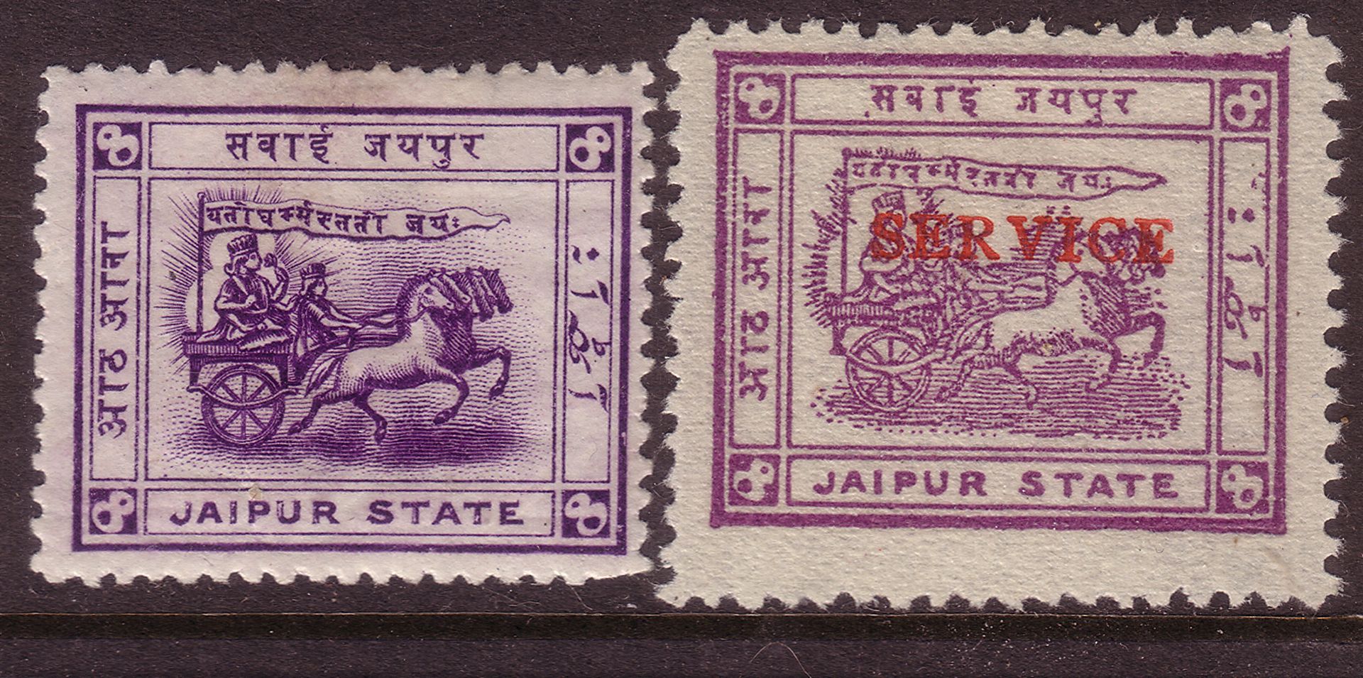 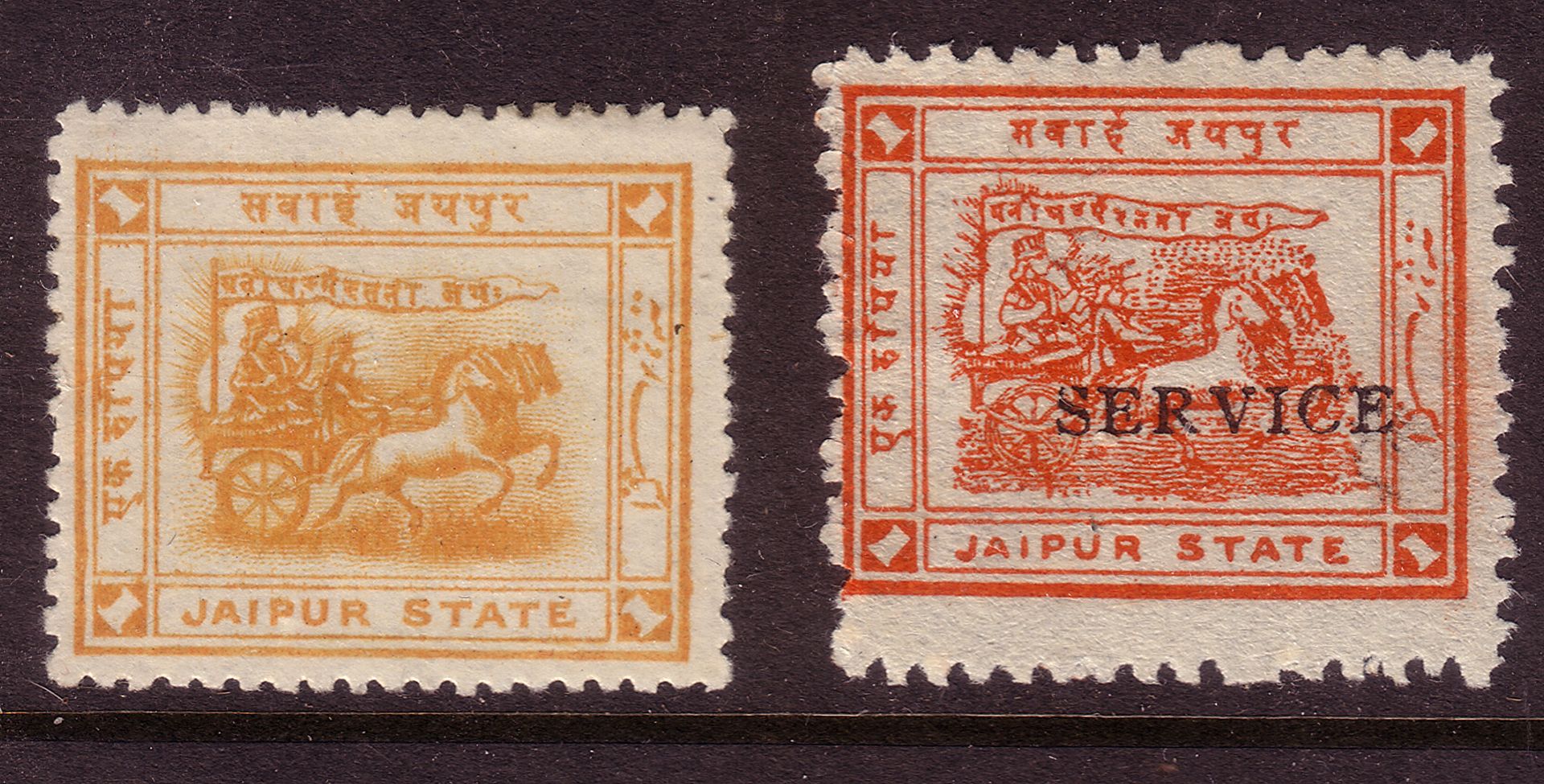 The recess 1 Rupee appeared in shades of yellow to ochre. Apparently the printers thought them a bit wishy-washy, and instead opted for the vermilion, which looks confusingly similar to some of the red shades. All the typo values were also overprinted SERVICE, but none of the recess printings were. |
|
Send note to Staff
|
|
|
Pillar Of The Community
Canada
5416 Posts |
|
|
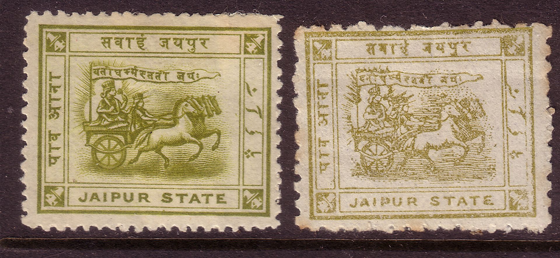
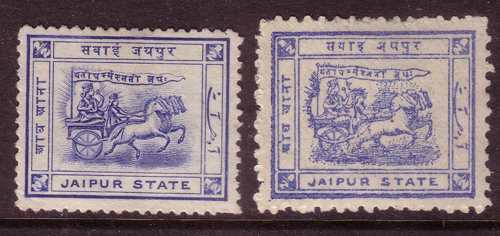
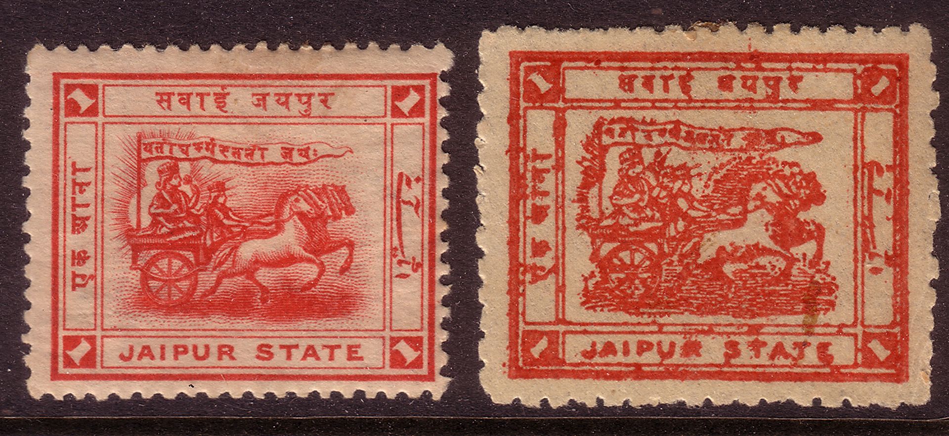
Thanks Tony for showing the Jaipur ones.
Yes the engraved ones certainly have very sharp detail but
those typos have this local rustic flair about them.
BTW what's this Jail Press ?
|
|
Send note to Staff
|
|
|
Pillar Of The Community
Canada
5416 Posts |
|
|
Anthony, I always have problems with the Machins.
I would say the top right and the last two on the bottom
are photogravure.
But because of the modern photo/litho process they are hard
to tell apart. |
|
Send note to Staff
|
|
|
Pillar Of The Community
United Kingdom
1361 Posts |
|
|
Pillar Of The Community
Canada
5416 Posts |
|
|
Looking at the jagged edges of the 2p on the upper right
compared to the sharply cut numeral of the top left
made me believe that it was photogravure.
Also the screening on the Queens face gives it
a kind of a livelier look than the dull litho print. |
|
Send note to Staff
|
|
|
Pillar Of The Community
Canada
5416 Posts |
|
|
These two from Argentina are a good example showing some of the differences between Typography and Offset/Lithography. Note how on the Typographic ones the corners protrude caused "as the ink is squeezed outward and over the vertical edge of the printing surface when pressure is applied by the ink roller." *Wheras Offset/Litho colours are solid, on Typography stamps they appear spotty as for instance on the numeral 50c. Scott 687 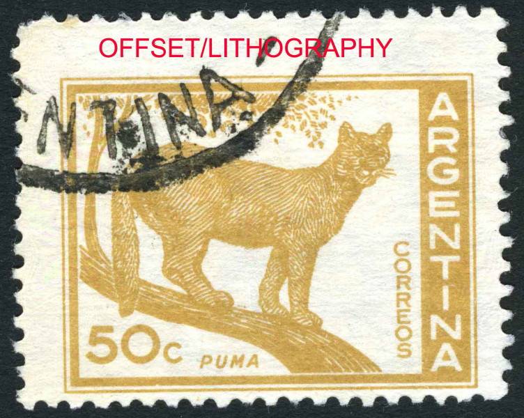 Scott 688 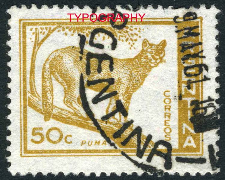 Scott 695C 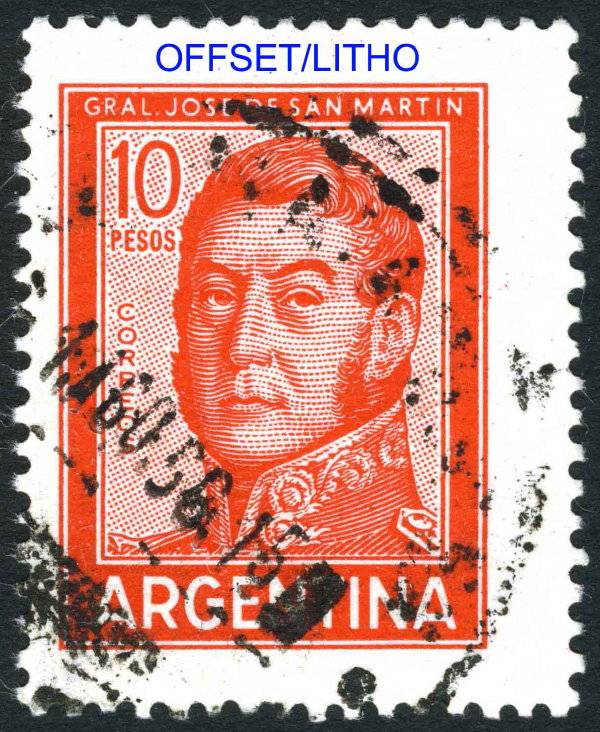 Scott 692 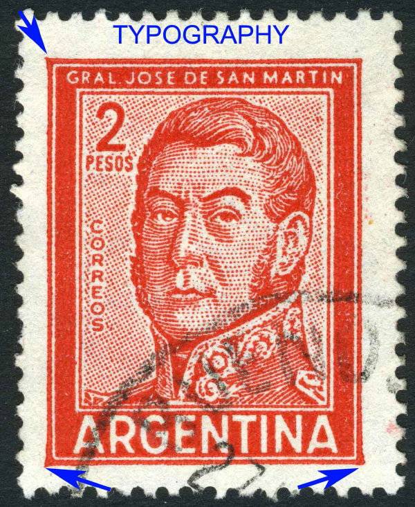 * *Linns Weekly http://www.linns.com/howto/refreshe...rcourse.aspx |
|
Send note to Staff
|
| Edited by lithograving - 03/21/2018 9:38 pm |
|
|
Pillar Of The Community
Canada
6525 Posts |
|
|
I sold these three Peruvian postal tax stamps a while ago, I think to someone here on SCF (how embarrassing I can't remember who you are!).  Three different printers - American Banknote Company (1938), Columbian Banknote Company (1943) and Thomas De La Rue & Co. (1951). There is a fourth printed by Harrison & Son's Ltd (1962). All lithograph. |
|
Send note to Staff
|
|
|
Pillar Of The Community
Canada
5416 Posts |
|
|
Nice James that's what I call a great example of different
printers. Now if we could find one done by 5.
Any chance to get a larger scan so the printers' names
are more visible.
Are there any differences in printing at all that you can spot James? |
|
Send note to Staff
|
|
|
Pillar Of The Community
Canada
6525 Posts |
|
|
I no longer have any examples of these so I can only enlarge the scan I had, and run it through the optimizer.  though it doesn't seem to want to get a lot bigger. Sorry. Perhaps someone else has some of these and can provide better scans. The differences I can see from my scan are of course the obvious colour variations. Also the De La Rue print seems to have a little more detail in the figure of the statue. |
|
Send note to Staff
|
| Edited by jamesw - 12/22/2011 6:40 pm |
|
|
Pillar Of The Community
Canada
6525 Posts |
|
|
These Argentinian stamps have confounded me for a while. I have a few of them and there's a real variety in the printing quality. They were issued in 1945-45. In that time were were 5 variations. SC#547 is typographed and has watermark 90. 547a is lithographed with watermark 90. SC#548 is lithographed with water mark 288, SC#549 is typographed and unwatermarked and 549a is lithographed and unwatermarked. All the examples I have have watermark 90 (too bad because watermark 288 has some value). But as I said there are distinct differences. Here are two examples.  The example on the left is rather sharp and a nice deep carmine colour. The right is of poorer quality printing and lighter in shade. The ink is not layed down as completely as on the left. After looking at Tony's Jaipurs, I would conclude that the left side is lithographed, the right typographed. Does that sound correct to all you experts? |
|
Send note to Staff
|
|
|
Pillar Of The Community
Canada
5416 Posts |
|
|
Quote:
I would conclude that the left side is lithographed, the right typographed. James from what I can make out on the scan I would tend to agree with you. Here a couple from France. Scott 1230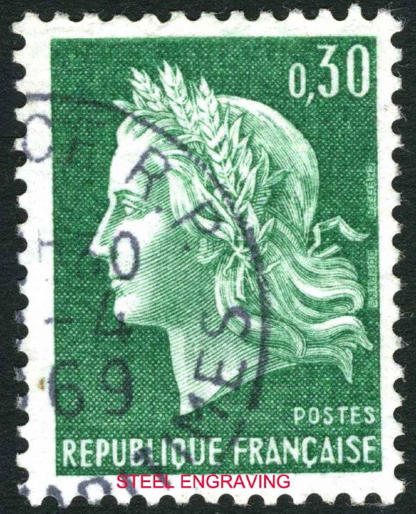 Scott 1231 Scott 1231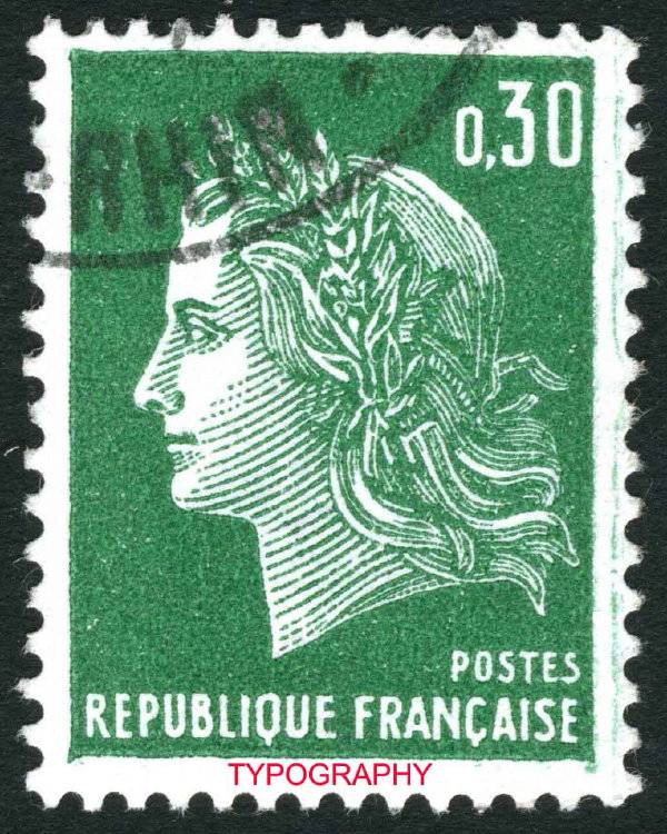 I think the differences in printing methods is quite obvious in these two. |
|
Send note to Staff
|
| Edited by lithograving - 03/21/2018 9:42 pm |
|
|
Pillar Of The Community
Canada
5416 Posts |
|
|
Yugoslavia issued some of their definitives first via engraving and later reissued the same design offset/litho. Even though the offset printings are not quite as sharp and a bit duller in colour they are still very comparable to the engraved ones. The printers in Belgrade did an excellent job in both cases. Here are some examples. ................... Scott 1065............................................ Scott 1483A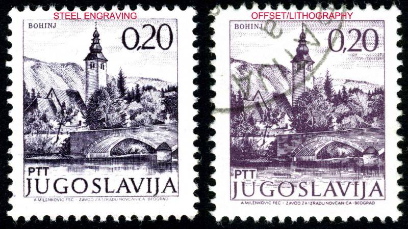 ..................... Scott 1068............................................ Scott 1486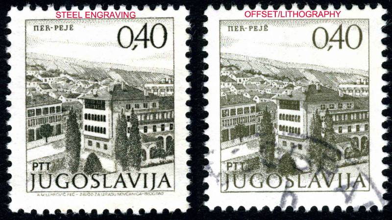 .................... Scott 1178............................................. Scott 1178a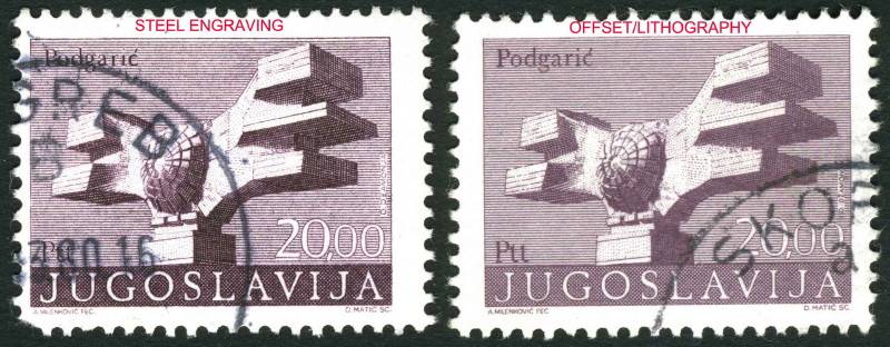 |
|
Send note to Staff
|
| Edited by lithograving - 03/21/2018 10:00 pm |
|
|
Pillar Of The Community
United Kingdom
1361 Posts |
|
|
I'm glad you revived this thread as I found these recently. L-R YT #521A, 521B, 522, 533 Marshall Petain 1951 First two are typography and second two engraved. Designed by Paul-Pierre Lemagny and engraved by Georges Hourriez.  |
|
Send note to Staff
|
| Edited by AnthonyUK - 01/08/2012 08:46 am |
|
|
Replies: 140 / Views: 57,170 |
|