| Author |
 Replies: 152 / Views: 78,038 Replies: 152 / Views: 78,038 |
|
|
|
Bedrock Of The Community
Australia
38679 Posts |
|
|
In this stamp, which one would assume a two pass process, the Coat of Arms in the white circle, above the EXPOZITIA GENERALA ribbons, moves around inside the circle depending on the stamp. The rest of the design remains identically positioned.  How does one explain that phenomenon?  |
Send note to Staff 
|
|
|
Pillar Of The Community
1554 Posts |
|
|
Rod, you mean to this coat of arms? :  The stams were printed with 2 plates: Orange and Brown. All printed in Orange is on a single plate and the coat of arms should be always in the same place, except that in the process of making the report of the images of the frames to form the plate (ancient lithographic process), coat of arms is has trated separately, one by one, and they stayed with small differences in its final location. |
|
Send note to Staff
|
|
|
Bedrock Of The Community
Australia
38679 Posts |
|
|
Jorge, you are a legend  I thought I had stumped SCF. I get your point, I am still dicombobulated as to why that actually happens. Perhaps the frame was ready before the design of the coat of arms which, as you say, must have been added later. I have never seen a single colour typography stamp behave in that way before. I received a third copy of that stamp in todays mail so I'll have a play with that one. Indebted to your contribution. Thanks. The amazing moving Coat of Arms.. (and appearing white spot, on Her Majesty's nose) http://imageshack.us/f/855/httpmake...edia102.gif/ |
|
Send note to Staff
|
| Edited by rod222 - 10/24/2012 02:29 am |
|
|
Pillar Of The Community
1554 Posts |
|
|
Ooopppsss! Well, it seems that I made a mistake : these stamps were printed in typography, then what I said about reports on lithographic stones has nothing to do. Mea culpa.
But if coat of arms are in different positions, it is possible that they were added later within the clises of the framework.
Perhaps the original idea was that the coat of arms were printed in Brown and then they changed their minds, and they added the coat of arms inside the white circles that had plate frames (where should go in Brown) to avoid making a new plate for Orange color ?
The Amazing moving Coat of Arms is great! |
|
Send note to Staff
|
|
|
Bedrock Of The Community
Australia
38679 Posts |
|
|
 I misunderstood your misunderstanding. Yes Jorge, I thought you meant initially there were differently produced cliches within the forme and yes, I think that is what happened At the least, an interesting anomally. |
|
Send note to Staff
|
|
|
Pillar Of The Community
7838 Posts |
|
|
Mother & child, printed by typography, and issued by Brazil on October 10, 1947 to publicize Child Care Week, Scott No. 677. - nethryk 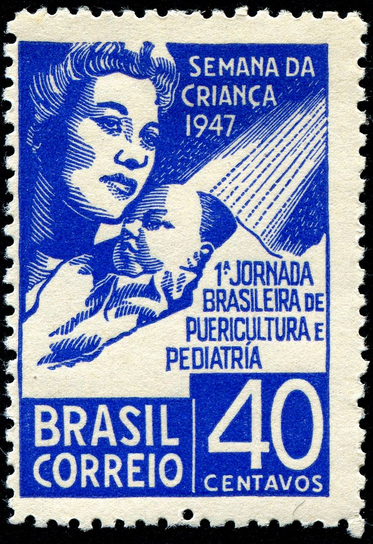 |
|
Send note to Staff
|
|
|
Pillar Of The Community
Canada
5416 Posts |
|
|
Here are Russia/USSR Scott 3602 & 3603. Scott shows them printed Litho but they both have the characteristics of Typography/relief printing. For example there is the uneven colour distribution evident on the lettering and blotchy solid colours. The scans don't show it but the colours in some areas are pressed into the paper leaving indentations as for example at the ballerina's right toe. Also on the back the raised portions are clearly visible which I believe can only be caused by Typography printing. So is Scott right with Litho ? I believe they are printed via Typography. 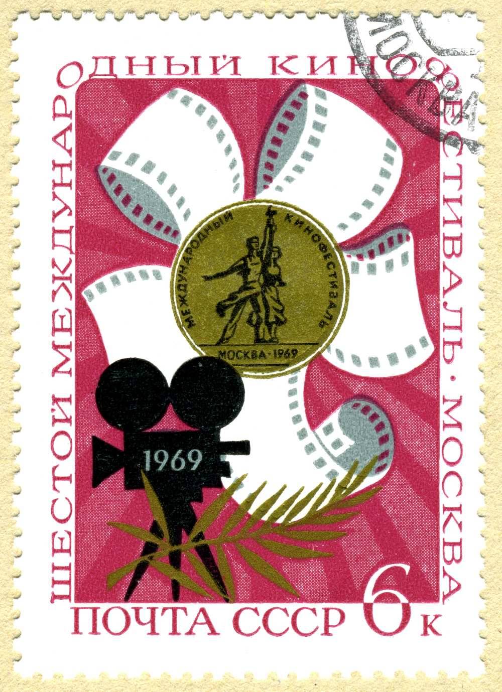 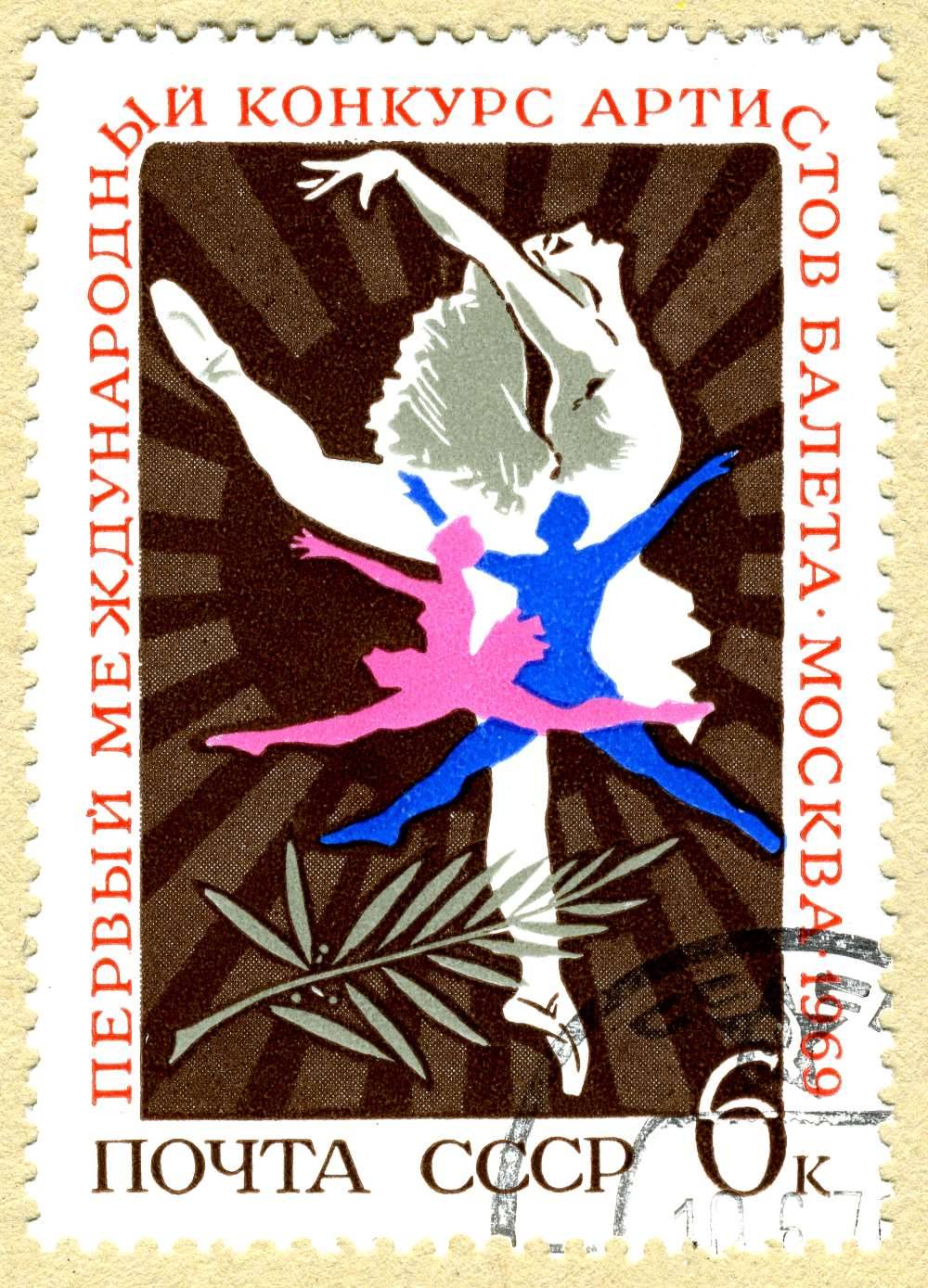 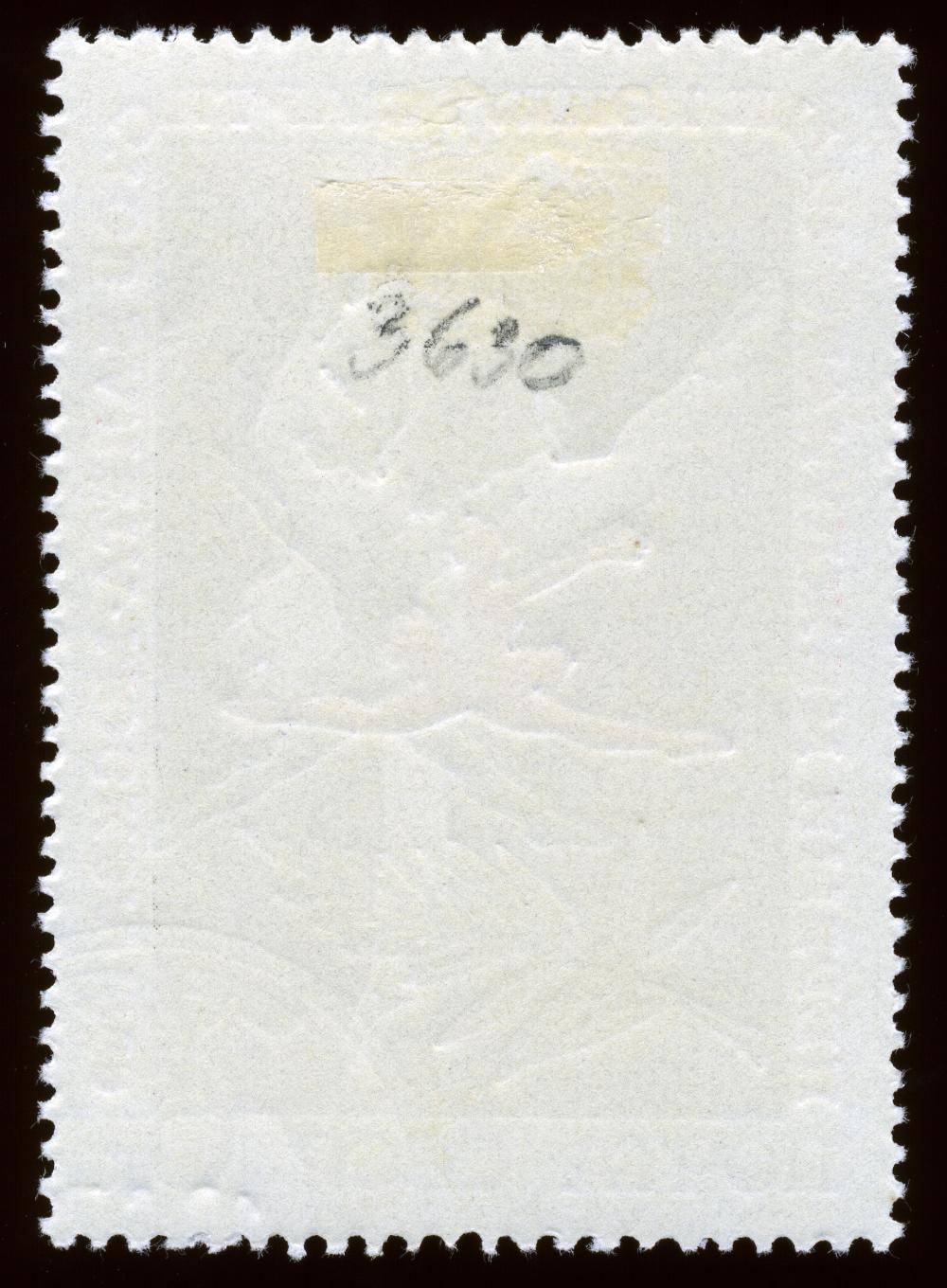 And no it wasn't me who wrote that catalogue number on the back. |
|
Send note to Staff
|
| Edited by lithograving - 03/23/2018 2:37 pm |
|
|
Pillar Of The Community
7838 Posts |
|
|
lithograving - The Zagorski USSR catalog confirms that both of these stamps were indeed printed by typography. Scott is wrong again. Also, I am posting my own example of the ballet dancers stamp in the "Let's Dance" thread. - nethryk |
|
Send note to Staff
|
|
|
Pillar Of The Community
Canada
5416 Posts |
|
|
Thanks nethryk for confirming my suspicions.
Yes I've spotted a few errors in Scott catalog but then again
all catalogues have them.
This Zagorski USSR catalog is this the bible of Soviet
Union stamps?
You certainly have a large Philatelic library.
|
|
Send note to Staff
|
|
|
Pillar Of The Community
7838 Posts |
|
|
lithograving - You're very welcome. Scott is chock full of errors, but as you say, in my experience all stamp catalogs have them to some extent. There are several Russian standard catalogs. Zagorski is one that I consistently find most useful for information about designers and engravers, but - fair warning! - it is written in Russian Cyrillic only, and it is only comprehensive up to 1980. I also have a copy of Victor Lyapin's catalog, which is written in both Russian and English, but it is only useful up to 1960. Also, from time to time I rely on a philatelic friend in Moscow for some of the harder-to-find information about Russian (USSR) stamps, particularly for 1981-91 period. - nethryk |
|
Send note to Staff
|
|
|
Pillar Of The Community
Canada
5416 Posts |
|
|
Thanks nethryk. I have enough problems with the Latin alphabet, never mind mind Cyrillic. It's all Greek to me. |
|
Send note to Staff
|
|
|
Pillar Of The Community
7838 Posts |
|
|
Aged Pensioner, semi-postal stamp designed by Max Buchholz, engraved and printed by typography on paper with a faint gray network by the Julius Sauer printing firm in Danzig, and issued by Danzig in March 1923 to benefit the Poor People's Fund, Scott No. B4. - nethryk 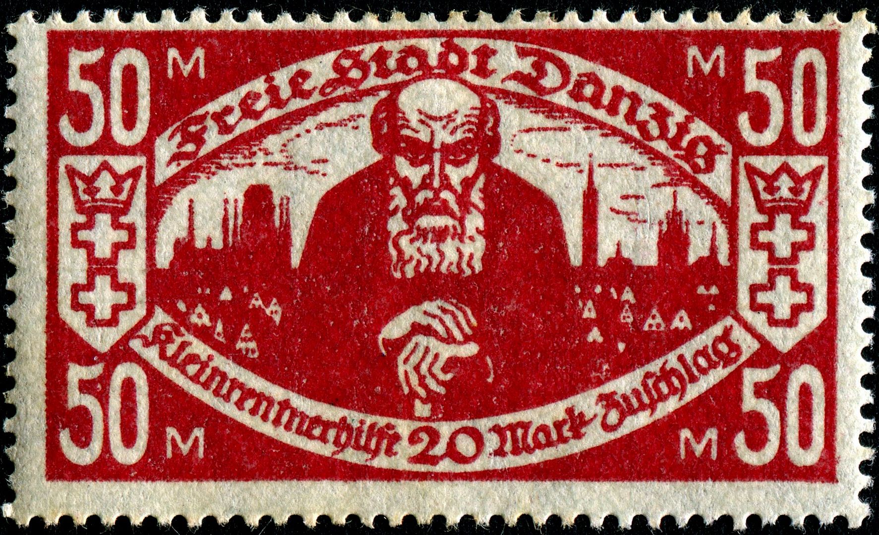 |
|
Send note to Staff
|
| Edited by nethryk - 11/01/2012 2:54 pm |
|
|
Pillar Of The Community
7838 Posts |
|
|
Grape grower from Saloio, designed by Portuguese artist Raquel Roque Gameiro (1889-1970), engraved by Renato de Penha e Cantos de Sousa Araújo (1911-1950), printed by typography, and issued by Portugal on April 4, 1941, Scott No. 607. - nethryk 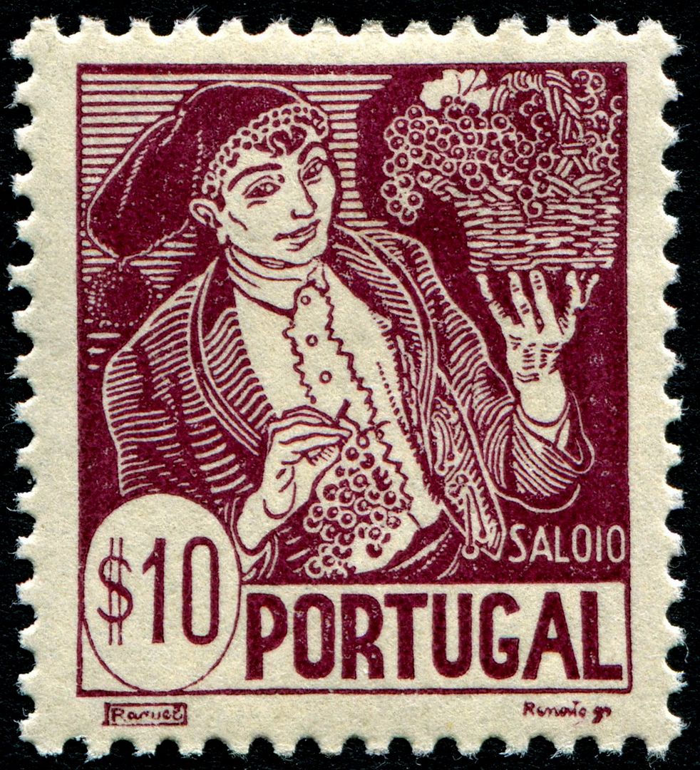 |
|
Send note to Staff
|
|
|
Pillar Of The Community
1554 Posts |
|
|
Pillar Of The Community
Canada
5416 Posts |
|
|
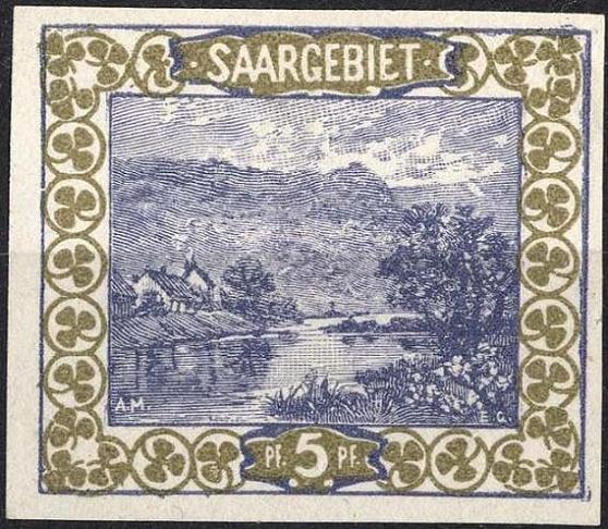
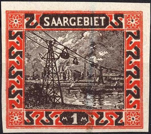
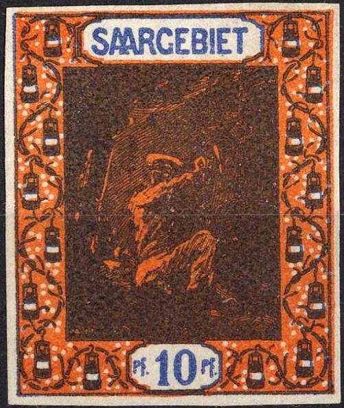
Jorge Saargebiet typos are not pretty but that's what
I like about them.
Besides around a hundred years ago typography was I believe
the only (cheapest?) way of printing bi, tri or multicoloured
stamps. |
|
Send note to Staff
|
|
|
Replies: 152 / Views: 78,038 |
|