Here are my thoughts on page design:
1. I like a more "traditional" look for my classic pages. I've seen some absolutely beautiful 19th century pages. Nice typography has really gone out the window with the advent of digital technology. I'd like to capture some of that old-world flavor in the pages.
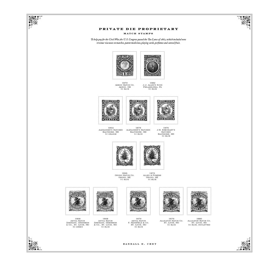
2. I'd like the pages to "breathe". Too many stamps on a single page makes it difficult to focus on the beauty of the stamps.
3. A generous bounding box for the stamps. This is very important for those who use mounts. I think most advanced collectors do. Use a faint bounding box line. Mine use a dotted .4 pt line. Heavy lines distract from the stamps and unless they are covered completely by a mount can make the page look sloppy.
4. At least a few pictures, in B&W not color. Color only makes the pages look modern, dramatically increases cost, and makes it more difficult for the stamps you have to be seen. The color fidelity you are going to get is will be hit or miss anyway.
5. Put the information about the stamps, above and below the stamps so it can be seen at all times.
6. Add some tidbits of information and period graphics if possible. My CSA pages will have some wonderful public domain Civil War engravings for instance.
7. I use 60lb cover stock for my collection pages. There's nothing worse than a flimsy page full of mounts and stamps.
The thing is, none of these really cost any extra, except for the cover stock vs text stock. That's pennies though. Attention to detail is what counts. Attached is the first two of the Proprietary Match Revenue. So what is your "wish list" when it comes to how pages should look?