| Author |
 Replies: 45 / Views: 1,927 Replies: 45 / Views: 1,927 |
|
Valued Member
United States
26 Posts |
|
|
The justice stamp is just a reference but the Dept of state Specimen looks doubled, I appreciate any help with this. Thank you, Eric 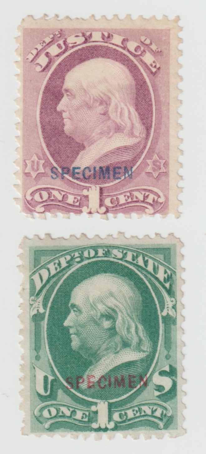  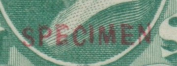 |
|
Send note to Staff
|
|
|
|
|
Bedrock Of The Community
11509 Posts |
|
|
Pillar Of The Community
United States
3159 Posts |
|
|
It, "SPECIMEN" does not look doubled but the letters are clearly out of alignment as if they were still loose when locked into the forme for printing. If such was the case, other examples of such out of alignment overprints should exist. Inconstant printing of the overprint is mentioned in the informational text before the section listing the SPECIMEN overprinted Officials. There is one good reason not to suspect a faked overprint as the added overprint lowers the value considerably from the non-Specimen, regular, unused stamp version. |
Send note to Staff 
|
|
|
Bedrock Of The Community
11509 Posts |
|
|
While I agree with PPG's logic I have never seen this overprint so misaligned and with different letter form. The "E" is a great example. It looks nothing like any of the other "E's". you find. If someone can show me a similar example I stand corrected. |
|
Send note to Staff
|
|
|
Pillar Of The Community
United States
710 Posts |
|
|
Pillar Of The Community
United States
9630 Posts |
|
|
I agree that there was really no reason to fake these, and they were pretty unpopular when issued and for some time after. I suspect loose lettering and a worn overprint is more likely to be the cause. |
|
Send note to Staff
|
|
|
Valued Member
United States
26 Posts |
|
|
Valued Member
United States
26 Posts |
|
|
Only thing about fake is why would anyone try to pass it off looking clearly wrong and it is less valuable as a specimen. im not sure how stamps are printed but I was thinking it could be some sort of printing error |
|
Send note to Staff
|
|
|
Valued Member
United States
26 Posts |
|
|
Pillar Of The Community
United States
3159 Posts |
|
|
Quote:
If it is not fake and it is an error does it have any value? Not beyond the basic normal Specimen version of the stamp, for some it may have a decrease in value. To be clear in my post above, I did not claim it was or wasn't fake just that if fake, the faker decreased value, not increased it. Just for fun, can you post the reverse side of both stamp you illustrate with the lighting coming from the side? |
|
Send note to Staff
|
|
|
Pillar Of The Community
United States
2806 Posts |
|
|
Bedrock Of The Community
11509 Posts |
|
|
Phil - The letters in your examples are well formed and look like all of the other genuine specimen examples you find. They are also well-aligned. The letters in the OP's stamp are badly misaligned and the middle leg of the first "E" is very poorly centered. This cannot be an original and ink is not the issue here. I think that someone was trying to create a O57Sd with a cv of $3850. You can look at multiples of O57S here and see that the letters are all well-formed and aligned. https://siegelauctions.com/power-se...SortOrder=-1 |
|
Send note to Staff
|
|
|
Valued Member
United States
26 Posts |
|
|
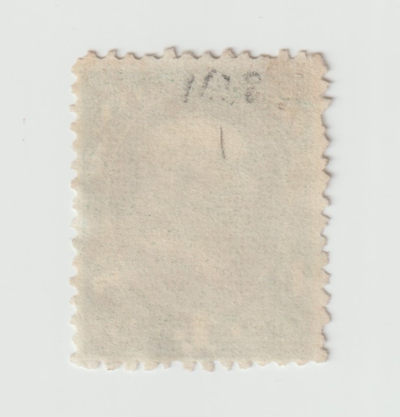
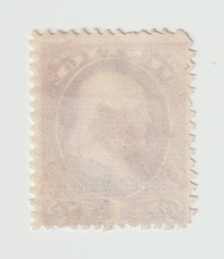
Everything except centering is right, almost like something got under the stamp while being overprinted. I uploaded the back of the stamps, lol just not sure where to |
|
Send note to Staff
|
|
|
Valued Member
United States
26 Posts |
|
|
Valued Member
United States
26 Posts |
|
|
Pillar Of The Community
United States
3159 Posts |
|
|
Quote:
You can look at multiples of O57S here and see that the letters are all well-formed and aligned. Not so if you examine the block with selvage. Position 1 is not fully printed as is the case on another position. The letters, especially the "I" wander vertically. This can bee seen with the enlarging feature once you bring up the image from the listing. Full disclosure, I did not bother to do the same with the larger block. The smaller made the point. |
|
Send note to Staff
|
|
|
Replies: 45 / Views: 1,927 |
|