| Author |
 Replies: 29 / Views: 2,930 Replies: 29 / Views: 2,930 |
|
Pillar Of The Community
United States
2932 Posts |
|
|
One valuable piece of advice. Maintaining a consistent format will eat you alive if you let it. Decide on the specifics of the formatting, and write everything down. How many mm between the top border and the title? How many mm between a stamp box and the caption? Etc., etc., etc. I have a template file that I use to keep spacing measurements for different items. I always have this file open when I'm working on a page. This way, I can always refer back when I forget my spacing measurements, alignments, etc. 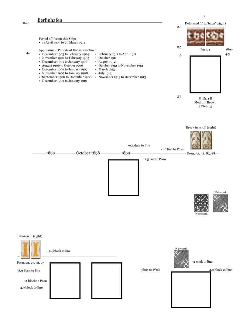 If the software you use supports on-screen guides, use them, and keep a master copy. For example, here is my guide template for letter-sized postmark pages, with the guides color-coded (InDesign allows this) to help me align various elements. 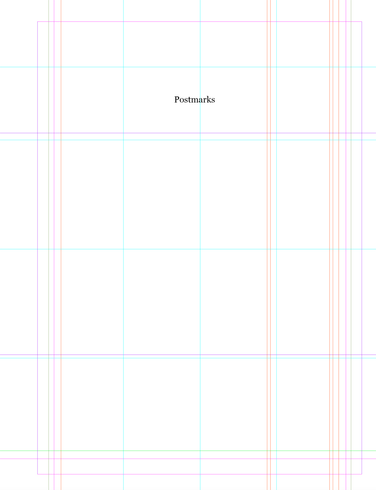 Looks like this when applied to an album page: 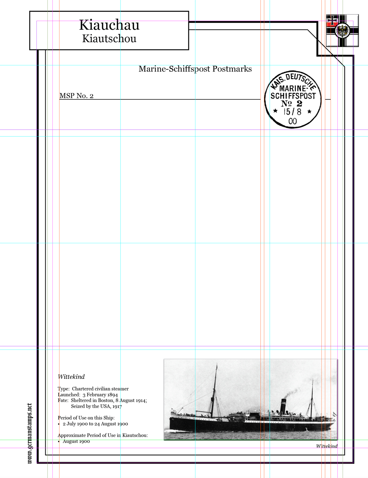 I didn't start doing this until late in the process. I originally just relied on copying and pasting from previous files/pages. This introduces error creep, and before you know it, your alignment is subtly (or not so subtly) off. Why am I mentioning this now? I just realized that a formatting error crept into my pages a long time ago, and has grown incrementally since then. To the naked eye it's hard to see without comparing older and newer pages side-by-side, but if I don't fix it, I'll always know... So off I go to fix 664 album page files with 23,704 pages.  |
|
Send note to Staff
|
|
|
|
|
|
Bedrock Of The Community
Australia
38679 Posts |
|
|
Quote:
One valuable piece of advice.
Maintaining a consistent format will eat you alive if you let it. Absolutely!  The very reason I use STEINER for my worldwide. Who is going to make their own pages for 400 countries? My personal pages are all the clunky old decrepit "Stamp Page Creator" but all constant design. |
Send note to Staff 
|
|
|
Valued Member
United States
245 Posts |
|
|
I agree. I've printed pages from multiple sources and have some regrets with the lack of consistency, especially when the different pages are in the same binder. But as my wife likes to remind me, "no one will see any of this until your dead" So maybe being too uptight about it only causes unneeded stress.
|
|
Send note to Staff
|
|
|
Valued Member
Canada
403 Posts |
|
|
Quote:
The very reason I use STEINER for my worldwide.
Who is going to make their own pages for 400 countries? I absolutely agree with the importance of maintaining a consistent page design, unfortunately, however, as excellent as PostmasterGS's pages are, to my eye, Steiner pages are only utilitarian at best. I took the middle road, a trade-off between the amount of time spent creating pages and the final result, e.g examples from my Palestine Mandate and Union of South Africa albums for 248 x 282mm Stanley Gibbons blank pages:   On the other hand, I wouldn't like to create pages for 400 countries  I only collect 12 countries, most of which are relatively small, so album layout is not too enormous a task for me. Also, it doesn't take much time, I only add pages as I need them, but I don't think that I have spent more than 10 hours in total on laying out an entire album. Printing and applying mounts are far more time-consuming. Needless to say, I use AlbumEasy for my page layout. Clive |
|
Send note to Staff
|
AlbumEasy - Free software for creating custom stamp album pages ImageSleuth - Images, hidden inside images, revealed. A retroReveal alternative PSGSA - The Philatelic Society for Greater Southern Africa |
| Edited by clivel - 01/08/2023 01:51 am |
|
|
Pillar Of The Community

United States
4075 Posts |
|
|
Yes, creating a style sheet is important if you want a consistency. I have used both graphic design like Scribus vs syntax driven (like Album Easy). In the syntax mode, it is easier to make massive changes. even though the graphics problems do have styles. |
|
Send note to Staff
|
Al |
|
|
Pillar Of The Community
Spain
517 Posts |
|
|
An effective way to highlight phosphorescences without writing too much 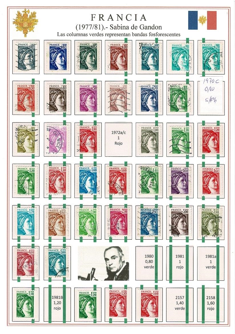 |
|
Send note to Staff
|
|
|
Pillar Of The Community
Netherlands
5356 Posts |
|
|
An interesting way of representing phosphor bars on stamps. The page looks nice. I do think, however, this can become hard on the eye when stamps come both with phosphor bars and integrated phosphor coating or when fluorescent agents added to the phosphor bars fluoresce in different colours. It, also, may become hard on the eye when phosphor bars can vary in width or have gradated phosphor bars.
As I am not familiar with these stamps, one question that arises is whether the lack of a green bar means the stamp has no phosphorescent property or that it has a phosphor coating. |
|
Send note to Staff
|
|
|
Pillar Of The Community
Spain
517 Posts |
|
|
These stamps are uncoated. No bars means no phosphor.
For other series, such as Buzin's Belgian birds, I use a thicker green frame for the phosphorescent ones and blue for the fluorescent ones. |
|
Send note to Staff
|
|
|
Pillar Of The Community
Spain
517 Posts |
|
|
Pillar Of The Community
Netherlands
5356 Posts |
|
|
Moderator

United States
12330 Posts |
|
|
Nice approach Roberto59. I do agree with NSK in that the strong green hue tends to draw/distract my eye. Here is an example of your approach but with a lighter hue  Don |
|
Send note to Staff
|
|
|
Pillar Of The Community
Spain
517 Posts |
|
|
Ja, ja, ja, ja. You are right, but they were my first sheets made like this. I got the idea from a colleague from Barcelona, #8203;#8203;but he had his stamps mounted in black. First I did it on a yellow sheet and the bands in yellow. The printers interpret the color white as "do not write" and the French flag was sad, while the bands were hardly visible. I changed the color of the bands and put a white sheet, as you have seen, but if I had done with black mounts it would have turned out better. When placing transparent mounts, it would have been enough not to remove the bands from the frame. The sheet is a cluster of errors, but I won't do it again to leave it like this. You always learn from mistakes and this sheet is a clear example.  |
|
Send note to Staff
|
|
|
Pillar Of The Community
United States
803 Posts |
|
|
Quote:
The very reason I use STEINER for my worldwide.
Who is going to make their own pages for 400 countries? Exactly my thoughts as well. There are some creative folks on this forum - all you have to do is look at their unique style in creating album pages. Since I collect worldwide, I have to balance time spent on making album pages with sorting and mounting on those album pages. I also like the pages to be consistent. I decided on a simple solution, outlined in the following steps: 1. Steiner pages are the meat. I edit a Steiner page in LibreOffice Draw to fill the stamp boxes with black blackground/white text. This takes about 30-60 seconds per Steiner page. I print one at a time, preferably when I have a full page. Looks great with clear mounts. 2. For everything not contained on the Steiner page (or Steiner page replacements), I use an AlbumEasy Steiner clone source code, so that every page is uniform (more or less) with the Steiner look. I use a lot of quadrille page, Steiner-clone pages for extra stuff. Using the Steiner-clone source code, a page usually takes 2-5 minutes, whether it is quadrille based or stamp box based. This method works for me. I find that AlbumEasy allows you to do almost anything, once you look under the hood and experiment... John |
|
Send note to Staff
|
| Edited by johnsim03 - 01/21/2023 04:14 am |
|
|
Pillar Of The Community
United Kingdom
8196 Posts |
|
|
I don't collect everything and I don't make pages for everything - I have some printed albums. However, I've made pages for post-1936 Commonwealth, the Middle East, post-independence North Africa, post-independence Indo-China
it's really not trouble if you consider the album-making as part of the journey. I'm happy that others like Steiner. I just don't want his pages - souped up or not - on my shelves. |
|
Send note to Staff
|
|
|
Pillar Of The Community
6060 Posts |
|
|
Roberto,
Everyone has their own preferences for album pages, so I'll put my 2 cents into the discussion. I like the added underprinted bars as a creative way to designate the tagging. I agree with NSK & Don, they are too bold and tend to detract from the actual stamps.
Also, I find the page too crowded and lacking description - especially as one who knows very little about French stamps. I would split these into 2 pages so there could be some explanation of the series, and why there are stamps with no tagging, 1 bar, and 2 bars. The stamp in the upper right corner is the only one with a single tagging bar at the left. Why? Normal or error? It begs for some explanation. Also, the image of Pierre Gandon could be labeled and a few words entered about him. The page speaks to an advanced collector, but does very little for an average collector and almost completely fails to communicate anything to a non-collector. |
|
Send note to Staff
|
|
|
Pillar Of The Community
United Kingdom
8196 Posts |
|
|
I like Roberto's page very much. It communicates a great deal more than Yvert's printed pages, by the way! |
|
Send note to Staff
|
|
|
Replies: 29 / Views: 2,930 |
|


