| Author |
 Replies: 152 / Views: 78,016 Replies: 152 / Views: 78,016 |
|
|
|
Rest in Peace
Netherlands
963 Posts |
|
|
Yes,
I do too!
Especially since I hadn't much material at all before 1924 collected. I am really starting to get back to the older stamps - Argentina 1882 onwards and Austria 1890 onwards - and I discover a lot!
The discussion on the Austria Forum about the 1945 Coat of Arms stamps forces me to get very critical of everything that had been written before. Traces [embossing] at the back of the stamp - or rather their lack of it - do NOT proof too much. The so-called typical outlines for typography may be ONE-sided only! And what does that tell us???
My main point of view is still the differences in paper structure...
British commonwealth stamps printed in typography on coated paper look like offset-printing - Malaya a.o. - and I am not sure it is just the result of the type of paper!
groetjes, Rein |
Send note to Staff 
|
|
|
Pillar Of The Community
1553 Posts |
|
|
Stamps printed in Typography Switzerland 1924 - Printed in 2 colors  Germany 1928 - Printed in 4 colors  |
|
Send note to Staff
|
|
|
Pillar Of The Community
1553 Posts |
|
|
Portugal 1934 First Portuguese Colonial Exhibition Designed by Almada Negreiros Engraved by Arnaldo Fragoso  |
|
Send note to Staff
|
|
|
Pillar Of The Community
Canada
5416 Posts |
|
|
Even though Antonin Delzers is mainly known for his steel engravings he also engraved a few for typographic printing. France Scott 219 1924 Pierre de Ronsard 1524-1585 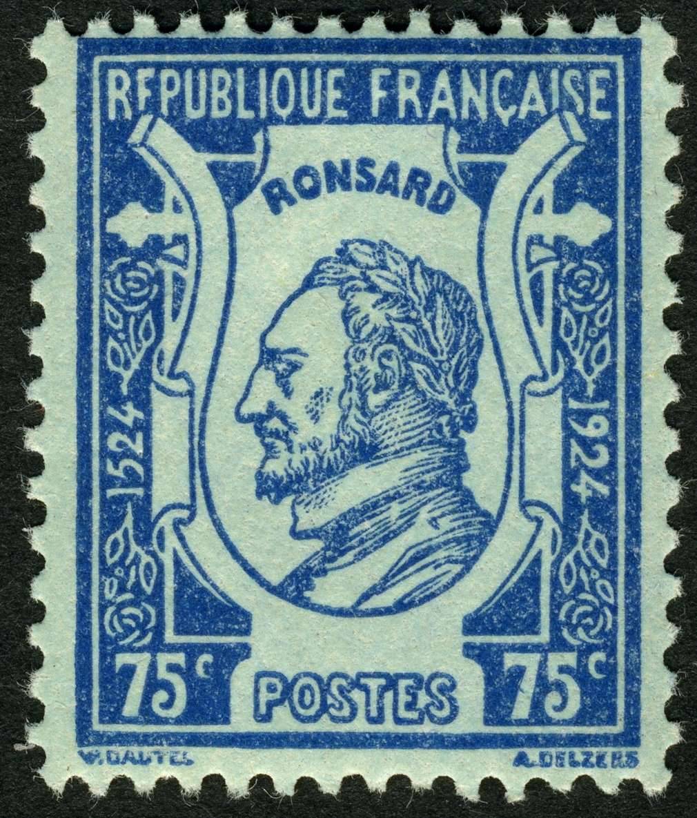 France Scott 243 & 244 1927 Visit of American Legionnaires to France. 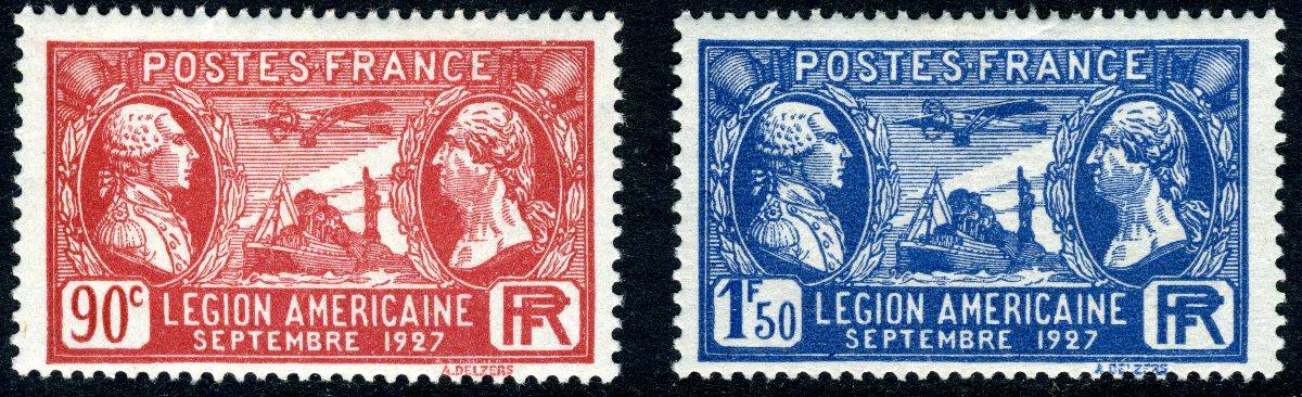 Also the Peace with Olive Branch definitive design which was issued between 1932 until 1941. Below is one of the values Scott 282. 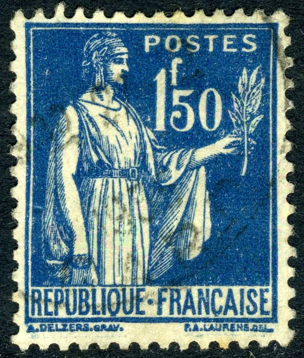 |
|
Send note to Staff
|
| Edited by lithograving - 03/23/2018 3:11 pm |
|
|
Pillar Of The Community
United States
7239 Posts |
|
|
I think that the beauty of typography, or letterpress stamps is a major reason why 19th century stamps have been, and always will be the most sought after items by stamp collectors. The Portuguese Colonial Exhibition set has always been one of my favorites. The 19th century De La Rue letterpress printings of Great Britain exemplify the skill and talent of the artist, designers, and printers. Supple line work is not printed quite as nicely with lithographic printings. Here is a circa 1900 bicolor letterpress printing of a charity label by the Reichsdruckerei in Berlin, Germany.   |
|
Send note to Staff
|
| Edited by bookbndrbob - 04/05/2016 11:16 pm |
|
|
Pillar Of The Community
United States
7239 Posts |
|
|
Bedrock Of The Community
Australia
38679 Posts |
|
|
The jury is still out on the Turkish Ay Yildiz Issues. Scott still chooses Lithography, I prefer Typography. 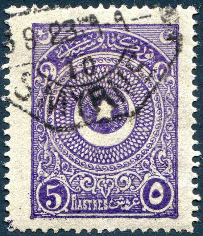 |
|
Send note to Staff
|
|
|
Pillar Of The Community
Canada
5416 Posts |
|
|
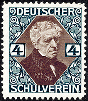
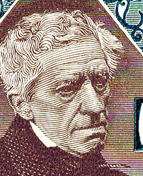
Bob, roughly what year would that Grillparzer label be from?
To me it appears Jugentstil around 1900 or a bit later. |
|
Send note to Staff
|
|
|
Pillar Of The Community
Canada
5416 Posts |
|
|
Rod, looking at the corners with the excess ink makes me
think typography also.
Michel agrees with Scott that they were printed lithography but
they call these Steindruck (stone print) compared
to modern Offsetdruck. |
|
Send note to Staff
|
|
|
Pillar Of The Community
United States
7239 Posts |
|
|
Lithograving, I agree. Every part of the design seems to indicate that period.
Rod, I think you are correct. The printing of the frame line and the small dots outside of it are certainly characteristic of letterpress printing. |
|
Send note to Staff
|
| Edited by bookbndrbob - 03/23/2018 9:22 pm |
|
|
Bedrock Of The Community
Australia
38679 Posts |
|
|
Thanks LG and Bob.
The curious thing, was reading a commentary this year, from a Philatelist owning a Vermeil in this stamp's study.
He had all sorts of trouble with establishing just what these were.
To the point of seeking out experienced printers for their opinion,
which both stated the decision was "difficult" but leant towards letterpress.
(I thought it screamed letterpress) but then I read Rein's comments in this post, and confirmed that letterpress not need leave an "indentation" from the die, so I was encouraged to keep with Letterpress.
The Philatelist's argument, was encouraged by 2 things.
1. marginal markings on Selvedge showed letterpress embossing .
2. Some stamps were evidenced as 'skewed" in a block of printed stamps, suggesting separate cliches in a forme.
I treat Lithography v Letterpress now, with added respect.
|
|
Send note to Staff
|
|
|
Pillar Of The Community
Canada
5416 Posts |
|
|
Thanks for sharing your efforts in differentiating
between lithography and typography.
Shows how difficult it can be when even the experts
aren't sure. |
|
Send note to Staff
|
|
|
Pillar Of The Community
United States
7239 Posts |
|
|
Yes, sometimes it is impossible to tell the difference between letterpress and planographic printing. Even if you view with magnification and use angled light, you cannot see the indentation that type-high printing leaves.
In the case of the Rod's Turkish stamp, the frame line is lighter in the middle and darker on the edges, which is characteristic of a line which is made with the pressure of a raised die. A completely flat limestone surface wouldn't print lines such as this. I can't believe that it is a lithographic printing. |
|
Send note to Staff
|
| Edited by bookbndrbob - 03/23/2018 11:16 pm |
|
|
Rest in Peace
Netherlands
963 Posts |
|
|
Nethryk, 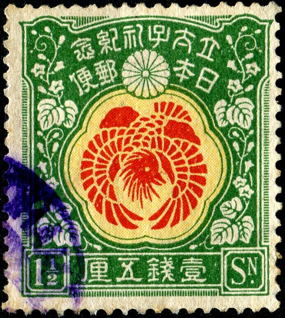 I am intrigued by the fine cross screen you will not find too often in stamps! |
|
Send note to Staff
|
|
|
Bedrock Of The Community
Australia
38679 Posts |
|
|
Edwardian Typography. British Postage Stamp Design John Easton 1943 En Épargne: (Fr.) "in relief" type of printing plate used in letterpress process. Orange River, and Zanzibar would be my favourites, Bermuda had promise, but the design around the circle, looks cartoonish to me, spoiling the design. 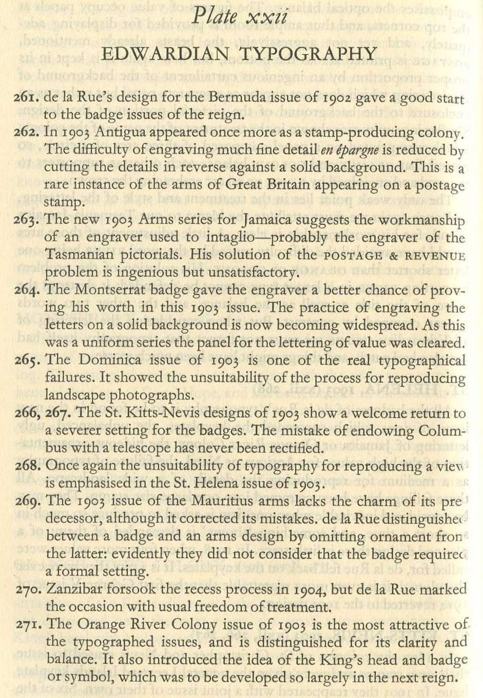 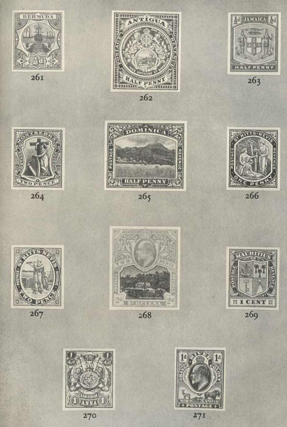 |
|
Send note to Staff
|
| Edited by rod222 - 10/20/2019 7:09 pm |
|
|
Replies: 152 / Views: 78,016 |
|